
DESIGN is as important as TECHNOLOGY
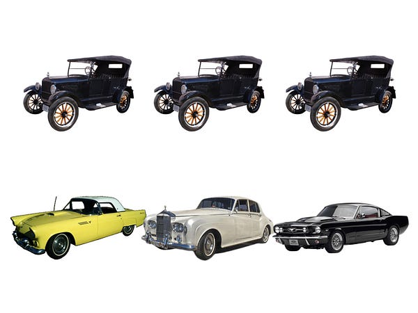
When the Model T first came out, the focus was on getting the technology right. We labored over getting the car from point A to point B and laying infrastructure down to support automotive networks. Back then, consumers did not have much choice in the design of their car. Cars were offered in black, black, or black, in this style only. Then, as technology and infrastructure became good enough, design became the differentiator. It wasn’t enough for your car to be fast, but it also had to look fast, or expensive, or powerful. Design has become the differentiator for the car market.
 |
| Design has become the differentiator in the car market |
Similarly, in the early days of the internet, the major challenges of the day were focused on getting it to work, reliably moving packets from A to B across proxies and servers and operating systems. Technology was so expensive that it required a lot of capital to form a company, and the technology was not yet widely in the hands of most consumers.
We’ve reached a stage where technology is now good enough. We have sensors and chips where we need them when we need them. We have compute cycles either in the device or in the cloud. We have storage for us to save every moment of our lives in high definition. Bandwidth is now fast enough that the internet just feels like it works. Not to say all the problems are all solved or that this future is evenly distributed across the planet, but the challenges of product development are now shifting towards building useful and emotional experiences that people get from using and interacting with technology.
 |
| Microsoft Office and Outlook vs. Google Docs and Gmail |
DESIGN is BRAND


Some of these cars are easily recognizable. Why? They include design elements that get carried over from generation to generation, and across each model car in the portfolio. The design of these cars is so consistent that you instantly recognize what they are. The cars that are less recognizable suffer because they lack this consistency. Lexus, for example, changes their designs every 2-3 years, which makes our mental models of what the car looks like less stable in our minds and thus harder to recognize.

When we think of brands, we think of logos and identities. But these are just symbols that represent companies. A company’s brand is consumers’ perception of that company, and that perception is built up over time, through experiences. When a consumer is interacting with your company through any capacity, you are literally in the process of creating your brand. Because consumers are interacting with companies mostly through their products, the fastest way for companies to build a strong brand is through design consistency. Thus, design is the brand.
 |
| Logos do not make a brand; experiences do |
DESIGN is SIMPLICITY
 |
| Muji product design principle: Kanketsu (simplicity) |
… but SIMPLICITY is very difficult to achieve!
 |
| 1999 |
 |
| 2001 |
 |
| 2002 |
 |
| 2006 |
 |
| 2007 |
 |
| 2011 |
 |
| 2014 |
It wasn’t until 2014 that Google truly achieved a simple home page, even simpler than what it looked like when it first launched. It took 15 years in the making of a company to achieve this level of simplicity, and certainly not because of lack of will or talent. That it took this long shows how difficult it is to achieve simplicity in the face of many people’s opinions, competing agendas, and growing product requirements and features. It’s a simple design, but was an incredibly difficult journey to get there.
DESIGN is TIMELESS
 |
| Braun product design: “Less, but better” |
Whether we’re talking about product design or graphic design, great design is iconic. It’s not a fad, not showy, not trendy, not easily thrown away.
 |
| Timeless design |
DESIGN is the DETAILS
The details matter because they directly impact how we feel about a product or service after we interact with it. For example, here is a picture of a typical bridge with wrought iron railing. The vertical slats make you feel like you’re in prison. In Japan, when you look at railing, you get the sense that people are always thinking about how they can make even the mundane delightful.
 |
| Railings in Japan |
Manhole covers are another example. A typical manhole cover in the US looks like this. Yet when you look at manhole covers in Japan, every single manhole cover is beautiful, inspired, and different, making the journey through the streets of Japan more entertaining and joyful.
 |
| Typical manhole cover in the US |
 |
| Manhole covers in Japan |
In some contexts, attention paid to design details means the difference between delighting your users or not. In other contexts, insufficient attention paid to design details can impact conversion, adoption, engagement, and user trust.
DESIGN is EMPATHY made tangible
Let’s look at another example from Japan. Here is a ticket counter at a subway station. At the edge of the counter is a plastic strip, placed there so one can rest their umbrella or cane there while they fish out money for their ticket. Whoever designed this must have had tremendous empathy and compassion for people to have the insight to include this detail here. And whoever was writing the check for the creation of these ticket counters must have supported whoever had that design insight.
 |
| Train ticket counter in Japan |
Going back to the Google Apps example, we use Google Apps, not just because the apps are simple and easy to use, but because of what they allow us to do. The ability to collaboratively create and edit documents in real time, the ability to archive and search email, are functionality that people need, even if they didn’t understand that they wanted to do be able to do those things before they existed.
DESIGN is INTENT
Google really took this design insight to heart. While Braun’s design principle was “Less but better” and Muji’s was to “bring calm to people’s stressful lives”, Google’s main design principle has always been “Fast”. This principle has informed every design decision, and is reflected throughout the experience. For example, we show how long it takes to serve a search result. We strip away the page of clutter so users can better focus on the results. We know from human interface research that black text against a white background provides the best contrast for reading text on screens, thus enabling people to get to their destination faster.
 |
| Google design principle: “Fast” |
While the insight that latency matters was very much a design driven insight, the commitment to speed went beyond the purview of the design team. This value permeated throughout the company, from billions of dollars of capital outlay to create infrastructure to make web search as fast as possible to company OKRs centered around reducing latency. This aspect of the user experience could not have been achieved without a company wide commitment.
When we think about design, we often think about how a product looks. As makers of technology we might also understand deeply that design is not just about how a product looks but how it works: components that enable people to use your product, and how it all fits together. All that cascades from your company’s strategy, values, and principles, and the scope of the problem you choose to tackle. All of that manifests itself in the design of the experiences you offer.
 |
| Design runs deep and reflects the company’s internal state (credit: Jesse James Garrett) |
No New Tale to Tell

